BRANDING AND BRAND IDENTITY

SEA SOCIETY – REDEFINING SWIMWEAR THROUGH INCLUSIVITY

We challenge the rigid conventions of swimwear to create a flexible, clean visual universe that genuinely resonates with younger generations.

SECTOR

Fashion, Swimwear & Lifestyle

SERVICES

NAMING

POSITIONING AND ARCHITECTURE

VISUAL AND VERBAL IDENTITY

ART DIRECTION

BRAND ACTIVATION

PROJECT

The traditional swimwear industry has historically been surrounded by rigid stereotypes and aesthetic ideals that lack inclusivity. SEA SOCIETY was founded with the ambition of breaking down these barriers through a flexible, diverse, and authentic swimwear collection. The challenge was to develop the brand’s DNA, its value proposition, and its conceptual framework from scratch, with the goal of conveying a genuine sense of freedom, lightness, and confidence that would connect organically with a young audience (under 30).

We designed a comprehensive and versatile brand identity that eschews artifice in favor of a clean, luminous, and uninhibited aesthetic. Through fresh art direction, an adaptable graphic system, and an approachable verbal narrative, we ensure that inclusivity is not just a slogan, but a tangible experience.
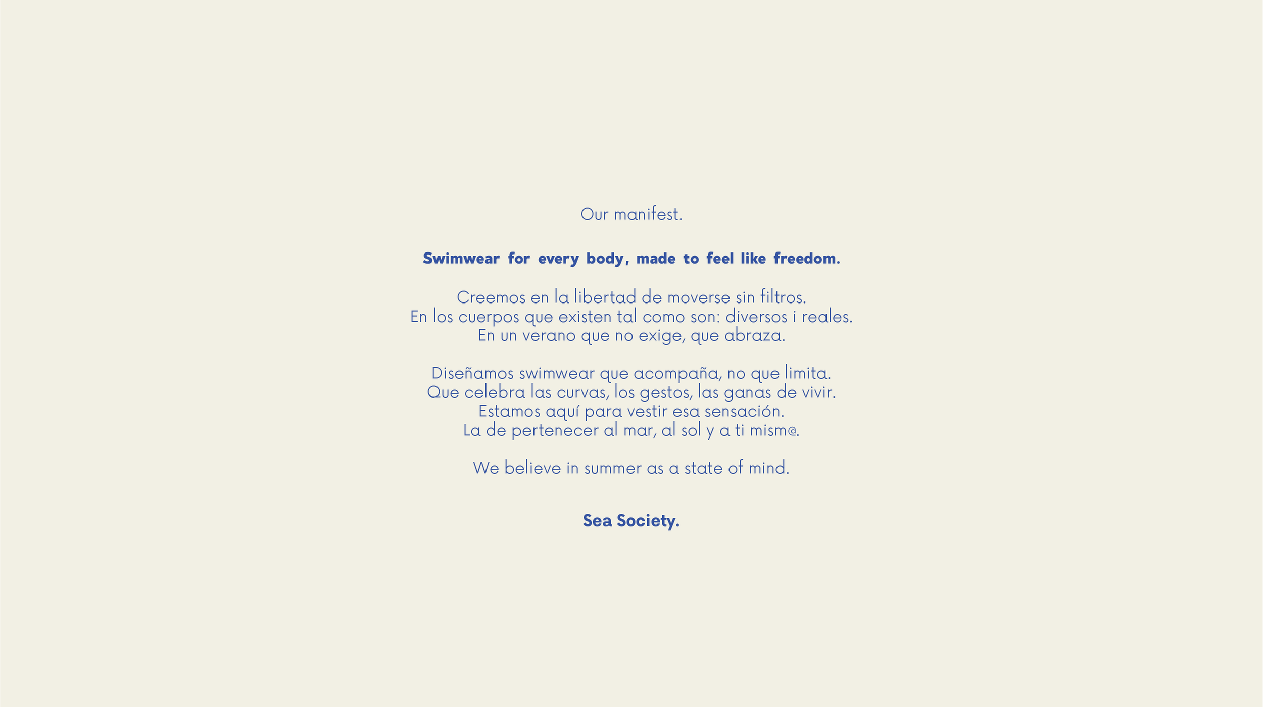

Website featuring the manifesto of a brand called Sea Society, which promotes swimwear designed to make you feel free, with text in Spanish and English.
A person lying on the beach in a white swimsuit is holding a newspaper with the headline "Breaking News," announcing the arrival of the Golden Break Surf Club this summer.
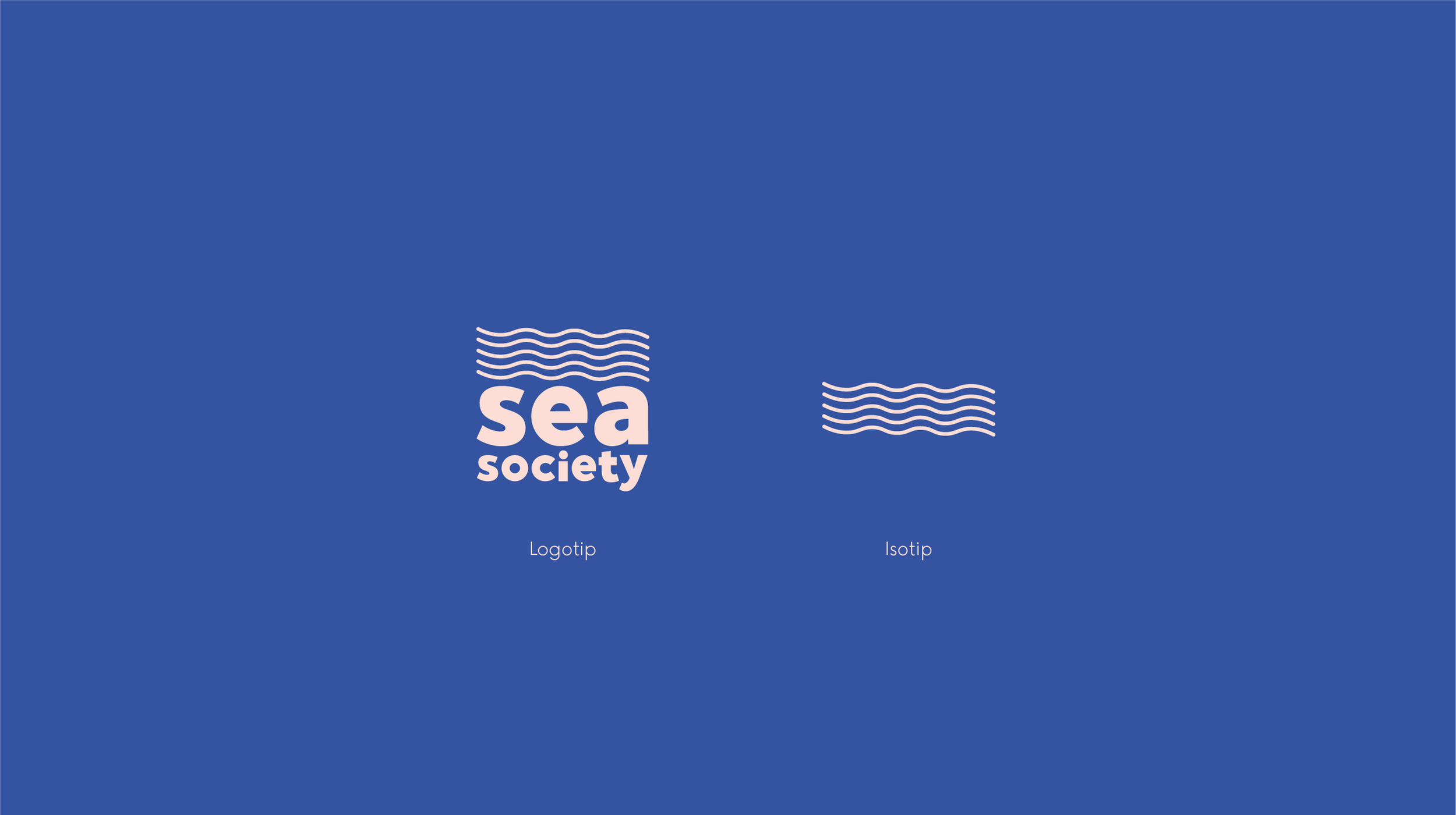
Blue background featuring the SEA Society logo, which includes waves and the text "sea society." The words "Logotip" and "Isotip" are displayed at the bottom.
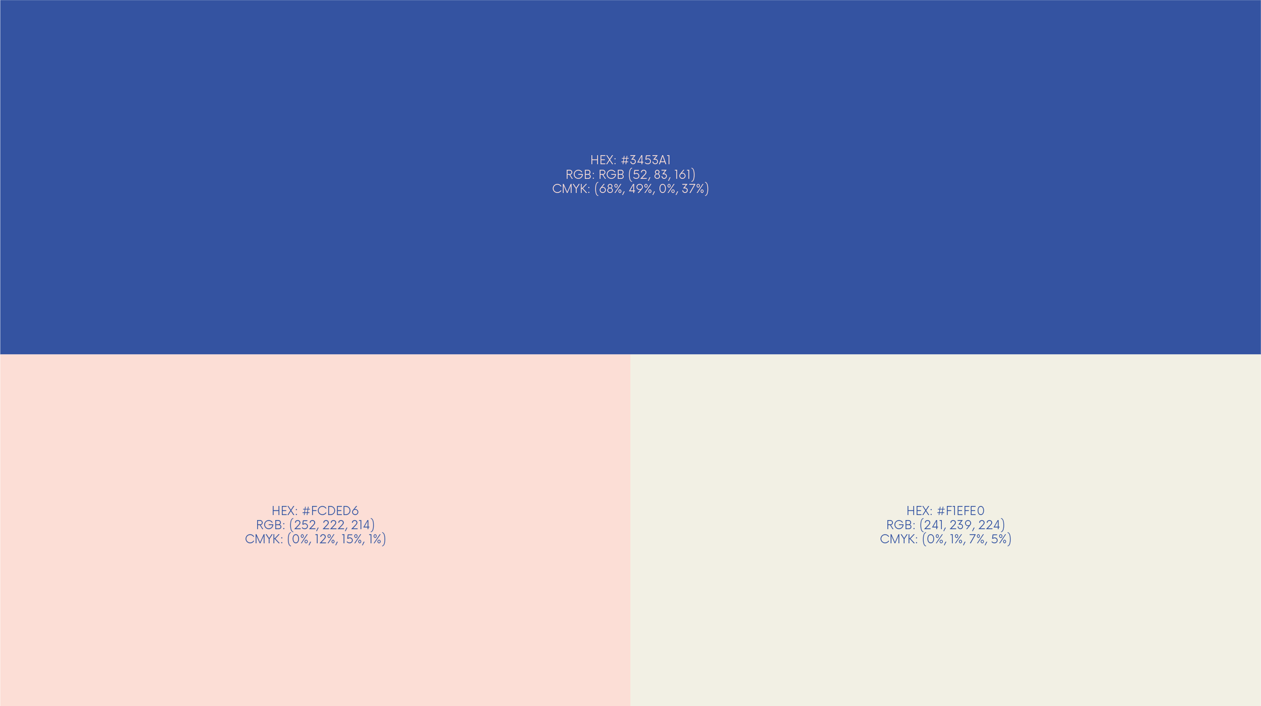
A sample of four colors in blocks, each with its hex code, RGB, and CMYK values: blue (#3453A1, 52, 83, 161, 68%, 49%, 0%, 37%), light pink (#FCDED6, 252, 222, 214, 0%, 12%, 15%, 1%), very light gray (#F1F1F0, 241, 239, 224, 0%, 1%, 7%, 5%).
A sequence of icons representing water, the sun, a lifebuoy, a flag, a heart, and a dolphin's tail.
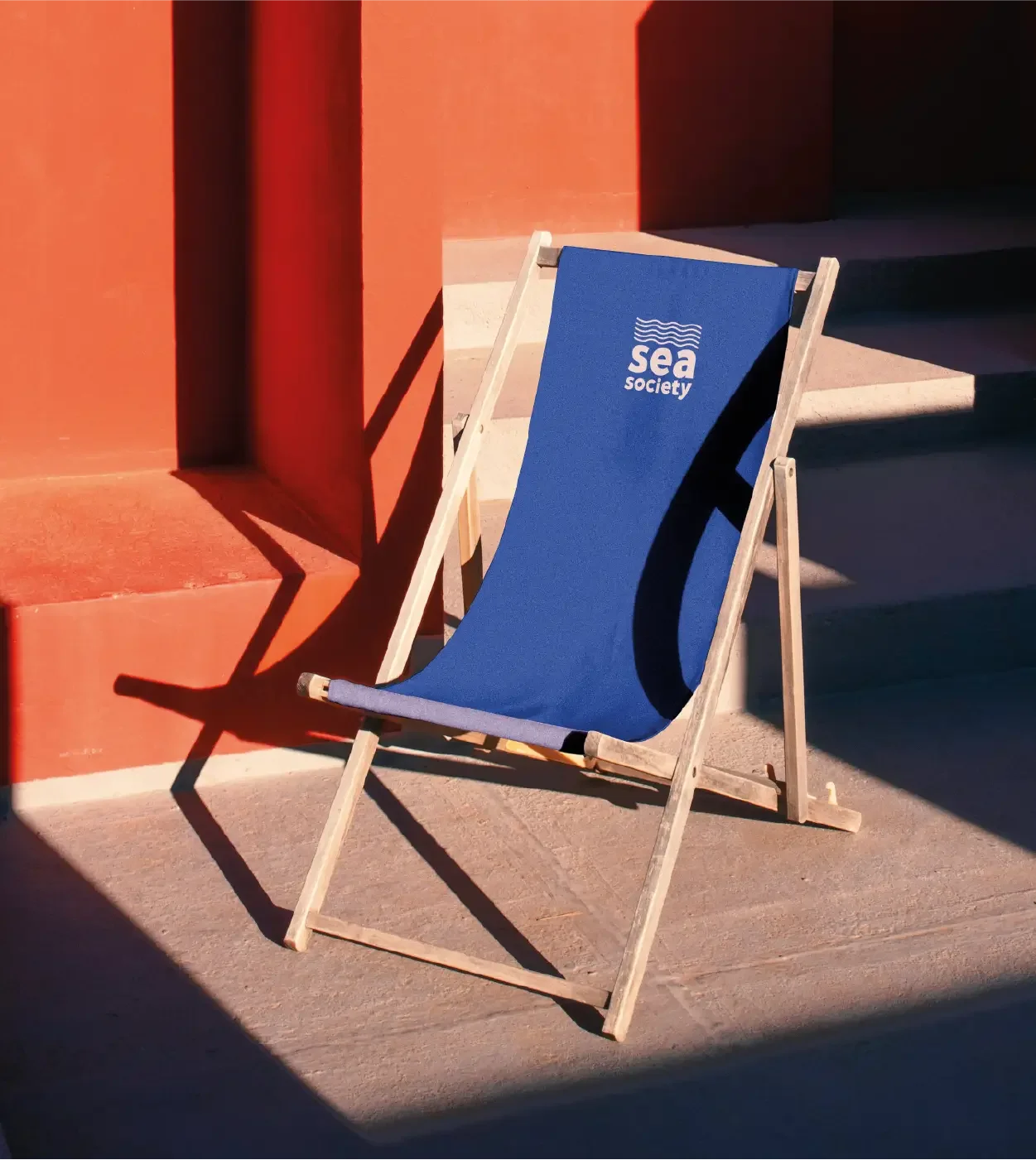
A blue lounge chair with the "SEA Society" logo in an outdoor setting next to an orange wall.
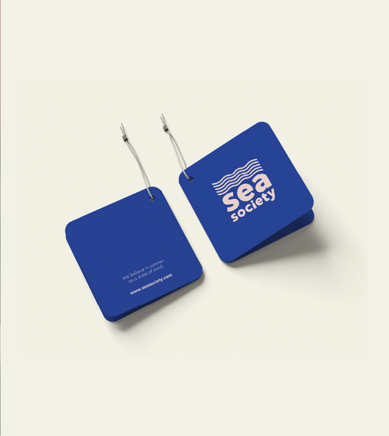
Identification tags featuring the Sea Society logo, in blue.
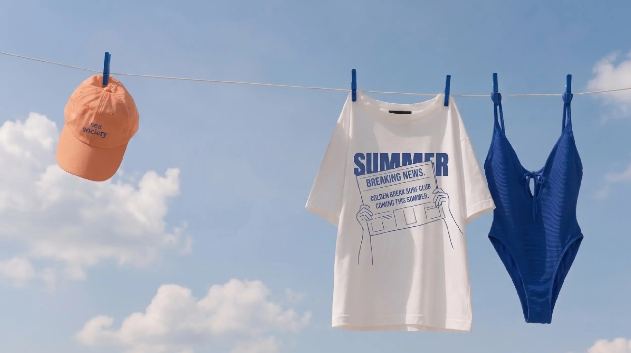
Clothes and a cap hanging from a clothesline with clothespins under the open sky.

THE BRAND AS A BUSINESS ASSET

THE RETURN OF BRANDING IN YOUR BUSINESS

Text indicating a 40% decrease in a certain oil quality indicator, with data sourced from IPA / Binet & Field.
A diagram showing a 3:2 ratio and indicating that it represents an aspect ratio of 3 to 2, with a reference to a source from the Harvard Business Review.
20% increase in margin; source: Bain & Company.
A 23% increase in revenue, according to sources from Marq and Demand Metric.

Let's get to work

together

LET'S TALK ABOUT WHAT YOUR BRAND CAN BECOME

BUILDING BRANDS WITH SOUL

BUILDING BRANDS WITH SOUL